Design Recipes: All about neutrals
Want to create a timeless color story, but don’t know where to start? A neutral color palette will not only create a foundation from which you can build any color palette, but it's timeless as well.
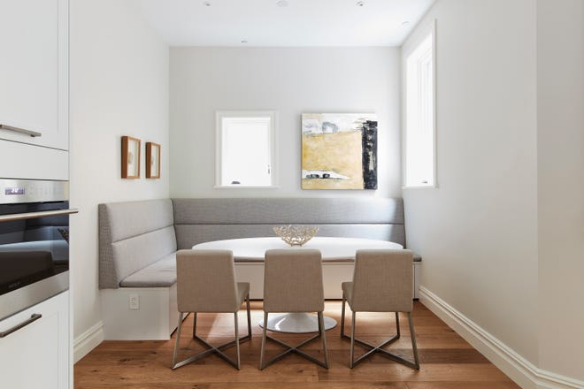
Neutral colors come in all shapes and sizes from tints, tones and shades of white to grays, browns and even black. Pairing certain neutrals together can provide the perfect blend for those looking for a calm, soothing environment.
Here are some top tips.
1. Look to incorporate large pieces that are solid as opposed to patterned. This provides for the most amount of versatility.
2. Infuse gray and cool tones in spaces that have an abundance of light and you desire to cool down.

3. Blend soft neutrals together such as tan, gray and muted pastels.
4. Incorporate tans and brown tones in spaces you wish to feel warm and cozy.
5. Use neutrals as a springboard to either a predominately neutral color palette or one in which you wish to infuse pops of color.
6. Blend metallics and florals into your neutral color palette.
7. Use rugs and artwork as an opportunity to bring in neutrals on a large scale.
8. Consider tactile materials as a way of softening a space.
9. Create a sense of contrast by pairing light neutrals such as taupe and gray with dark neutrals such as brown and black.

10. Consider pastels and pastel tones as a way to blend soft color into a neutral color palette.
Cathy Hobbs, based in New York City, is an Emmy Award-winning television host and a nationally known interior design and home staging expert with offices in New York City, Boston and Washington, D.C. Contact her at info@cathyhobbs.com or visit her website at cathyhobbs.com.